Unsupervised Learning(비지도학습)은 모든 data에 labeling할 필요가 없다.
가장 많이 쓰이는 비지도 학습은 8장에서 다뤘던 차원 축소이다.
그 외에도 clustering, outlier detection, density estimation 등이 많이 쓰인다.
Clustring
clustering이란, 비슷한 sample을 cluster로 모으는 것이다. 데이터 분석, classification, 추천 시스템, 차원축소 등에서 쓰일 수 있다.
각 sample은 하나의 cluster에 학습된다.
대표적인 clustering은 k-means와 DBSCAN, agglomerative, BIRCH, mean-shift, affiniity propagation, spectral clustering 이 있다.
일단 k-means와 DBSCAN만 살펴보면,
k-means clustering
알고리즘이 찾을 cluster 개수 k를 지정하면, sample은 k개의 cluster 중 하나에 할당된다.
코드를 보면,
from sklearn.cluster import KMeans

k = 5
kmeans = KMeans(n_clusters=k, random_state=42)
y_pred = kmeans.fit_predict(X)
y_pred # 각 data를 어느 cluster에 할당했는지 확인 가능
이 알고리즘은 centoid라고 부르는 특정 지점을 중심으로 모인 sample을 찾는다.
kmeans에서 의 센트로이드는 아래와 같이 확인할 수 있다.
kmeans.cluster_centers_
또는 아래와 같이 새로운 sample에 가장 가까운 centroid의 cluster를 assign 할 수 있다.
X_new = np.array([[0, 2], [3, 2], [-3, 3], [-3, 2.5]])
kmeans.predict(X_new)
이때 cluster의 Decision Boundary를 그려보면 voronoi 다이어그램을 얻을 수 있다.
def plot_data(X):
    plt.plot(X[:, 0], X[:, 1], 'k.', markersize=2)

def plot_centroids(centroids, weights=None, circle_color='w', cross_color='k'):
    if weights is not None:
        centroids = centroids[weights > weights.max() / 10]
    plt.scatter(centroids[:, 0], centroids[:, 1],
                marker='o', s=30, linewidths=8,
                color=circle_color, zorder=10, alpha=0.9)
    plt.scatter(centroids[:, 0], centroids[:, 1],
                marker='x', s=50,
                color=cross_color, zorder=11, alpha=1)

def plot_decision_boundaries(clusterer, X, resolution=1000, show_centroids=True,
                             show_xlabels=True, show_ylabels=True):
    mins = X.min(axis=0) - 0.1
    maxs = X.max(axis=0) + 0.1
    xx, yy = np.meshgrid(np.linspace(mins[0], maxs[0], resolution),
                         np.linspace(mins[1], maxs[1], resolution))
    Z = clusterer.predict(np.c_[xx.ravel(), yy.ravel()])
    Z = Z.reshape(xx.shape)

    plt.contourf(Z, extent=(mins[0], maxs[0], mins[1], maxs[1]),
                cmap="Pastel2")
    plt.contour(Z, extent=(mins[0], maxs[0], mins[1], maxs[1]),
                linewidths=1, colors='k')
    plot_data(X)
    if show_centroids:
        plot_centroids(clusterer.cluster_centers_)

    if show_xlabels:
        plt.xlabel("$x_1$", fontsize=14)
    else:
        plt.tick_params(labelbottom=False)
    if show_ylabels:
        plt.ylabel("$x_2$", fontsize=14, rotation=0)
    else:
        plt.tick_params(labelleft=False)

plt.figure(figsize=(8, 4))
plot_decision_boundaries(kmeans, X)
save_fig("voronoi_plot")
plt.show()

이러한 kmeans는 centroid까지의 거리만 고려하기 때문에, cluster의 크기가 많이 다르면 잘 작동하지 않는다.
기존의 hard clustering외에도, cluster마다 sample에 점수를 부여하는 soft clustering도 있다.
이때 부여하는 점수는 sample ~ centroid의 거리이거나, similarity score일 수 있다.
# 부여한 점수 확인
kmeans.transform(X_new)
kmeans 알고리즘이 동작하는 원리는 아래와 같다

-
k개의 centroid 초기화
-
dataset에서 k개의 sample을 선택한 후 그 위치에 centroid 놓기
-
각 sample을 가장 가까운 centroid로 이동시킴
-
센트로이드에 할당된 샘플의 평균으로 센트로이드를 업데이트
-
centroid 이동이 없을 때까지 3~4 반복
# centroid 초기화 방법
good_init = np.array([[-3, 3], [-3, 2], [-3, 1], [-1, 2], [0, 2]])
kmeans = KMeans(n_clusters=5, init=good_init, n_init=1)
kmeans.inertia # inertia 확인
inertia란, 최선의 solution임을 확인하는 지표이다. sample과 가장 가까운 centroid사이의 평균 제곱 거리이다.
k에 대한 inertia 그래프를 그려보면 (x축: k, y축: inertia) 최적의 k를 알 수 있다.
아래와 같은 엘보 부분이다
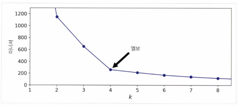
또는 실루엣계수 silhouette_score(X, kmeans.labels_)를 이용하여 점수가 큰 k를 최적의 k로 정의할수도 있다.
k-means ++
이미 sklearn.Kmeans는 k-means ++ 를 적용하고 있다. 이는 cluster를 완전히 랜덤하게 초기화하는 게 아니라 아래와 같이 진행하는 것이다.
- 데이터셋에서 무작위로 균등하게 하나의 센트로이드 c_1을 선택합니다.
- (D(xi))^2 / sigma(j=1 ~ m) (D(xj))^2의 확률로 샘플 x_i를 새로운 센트로이드 c_i로 선택합니다. 여기에서 (D(xi))는 샘플 x_i에서 이미 선택된 가장 가까운 센트로이드까지 거리입니다. 이 확률 분포는 이미 선택한 센트로이드에서 멀리 떨어진 샘플을 센트로이드로 선택할 가능성을 높입니다.
- k 개의 센트로이드를 선택할 때까지 이전 단계를 반복합니다.
minibatch k-means
전체 dataset을 통해 반복하지 않고 minibatch를 이용해 centroid를 조금씩 이동하는 방법이다.
속도가 3~4배 정도 빨라지며, 이너셔는 조금 더 나쁘다. 코드는 아래와 같다.
from sklearn.cluster import MiniBatchKMeans

minibatch_kmeans = MiniBatchKMeans(n_clusters=5, random_state=42)
minibatch_kmeans.fit(X)
with Clustering
clustering을 아용하면, 차원축소나 semi-supervised learning에 사용할 수 있다.
특히 차원축소를 통해 다른 supervised learning에서의 전처리 단계로 활용 가능하다
from sklearn.linear_model import LogisticRegression
from sklearn.model_selection import train_test_split
from sklearn.pipeline import Pipeline

X_train, X_test, y_train, y_test = train_test_split(X, y, random_state=42)
pipeline = Pipeline([
    ("kmeans", KMeans(n_clusters=50, random_state=42)),
    ("log_reg", LogisticRegression(multi_class="ovr", solver="lbfgs", max_iter=5000, random_state=42)),
])
pipeline.fit(X_train, y_train)
위 코드는 k-mean를 진행 후 Logistic Regression을 적용하여 성능을 향상시킨 case 이다.
이때 아래와같은 Grid Search를 통해 최적의 cluster 개수를 찾을 수 있다.
from sklearn.model_selection import GridSearchCV

param_grid = dict(kmeans__n_clusters=range(2, 100))
grid_clf = GridSearchCV(pipeline, param_grid, cv=3, verbose=2)
grid_clf.fit(X_train, y_train)
DBSCAN clustering
DBSCAN은 Density-based spatial clustering of applications with noise의 앞글자를 따서 만들었다.
이름에서 알 수 있듯, 밀집된 연속적 지역을 cluster로 정의한다.
작동 방식은 아래와 같다.
1. 알고리즘이 각 샘플에서 작은 거리인 ε (입실론) 내에 샘플이 몇 개 놓여 있는지 셉니다. 이 지역을 샘플의 ε-이웃ε -neighborhood이라고 부릅니다.
2. (자기 자신을 포함해) ε -이웃 내에 적어도 min_samples개 샘플이 있다면 이를 핵심 샘플core instance로 간주합니다. 즉 핵심 샘플은 밀집된 지역에 있는 샘플입니다.
3. 핵심 샘플의 이웃에 있는 모든 샘플은 동일한 클러스터에 속합니다. 이웃에는 다른 핵심 샘플이 포함될 수 있습니다. 따라서 핵심 샘플의 이웃의 이웃은 계속해서 하나의 클러스터를 형성합니다.
4. 핵심 샘플이 아니고 이웃도 아닌 샘플은 이상치로 판단합니다.
사용 코드를 살펴보면,
from sklearn.cluster import DBSCAN
dbscan = DBSCAN(eps=0.05, min_samples=5)
dbscan.fit(X)
dbscan.labels_
dbscan.labels_결과 일부는 -1로 나타나는데, 이는 알고리즘이 이 샘플을 outlier로 판단했다는 뜻이다.
핵심 샘플은 dbscan.core_sample_indices_로 확인 가능하다.
아래와 같이 그래프를 그릴 수도 있다.
def plot_dbscan(dbscan, X, size, show_xlabels=True, show_ylabels=True):
    core_mask = np.zeros_like(dbscan.labels_, dtype=bool)
    core_mask[dbscan.core_sample_indices_] = True
    anomalies_mask = dbscan.labels_ == -1
    non_core_mask = ~(core_mask | anomalies_mask)

    cores = dbscan.components_
    anomalies = X[anomalies_mask]
    non_cores = X[non_core_mask]

    plt.scatter(cores[:, 0], cores[:, 1],
                c=dbscan.labels_[core_mask], marker='o', s=size, cmap="Paired")
    plt.scatter(cores[:, 0], cores[:, 1], marker='*', s=20, c=dbscan.labels_[core_mask])
    plt.scatter(anomalies[:, 0], anomalies[:, 1],
                c="r", marker="x", s=100)
    plt.scatter(non_cores[:, 0], non_cores[:, 1], c=dbscan.labels_[non_core_mask], marker=".")
    if show_xlabels:
        plt.xlabel("$x_1$", fontsize=14)
    else:
        plt.tick_params(labelbottom=False)
    if show_ylabels:
        plt.ylabel("$x_2$", fontsize=14, rotation=0)
    else:
        plt.tick_params(labelleft=False)
    plt.title("eps={:.2f}, min_samples={}".format(dbscan.eps, dbscan.min_samples), fontsize=14)

plt.figure(figsize=(9, 3.2))

plt.subplot(121)
plot_dbscan(dbscan, X, size=100)

plt.subplot(122)
plot_dbscan(dbscan2, X, size=600, show_ylabels=False)

save_fig("dbscan_plot")
plt.show()
특이한 점은 DBSCAN은 새로운 sample에 대해 cluster를 예측할 수 없어 fit_predict()만 가능하다.
그래도 DBSCAN은 cluster의 모양, 개수에 상관없는 매우 간단하고 강력한 알고리즘이다
Density Estimation
dataset 생성의 random process의 확률밀도함수(PDF)를 추정한다.
이때 밀도가 낮은 곳에 놓인 sample은 outlier일 확률이 높으므로, outlier detection에도 이용된다.
Outlier Detection(이상치 감지)
‘정상’ 즉 outlier가 어떻게 보이는지를 학습한 후 ‘비정상’을 감지한다. 결함 제품을 감지하거나, 시계열 데이터에서 새로운 트렌드를 찾는다.
PCA, Fast-MCD, isolation forest, LOF, one-class SVM 등을 이용할 수 있다.
가우시안 혼잡 모델 (GMM)
샘플이 파라미터가 알려지지 않은 여러 개의 혼합된 가우시안 분포에서 생성되었다고 가정하는 확률 모델을 GMM이라고 한다.
GMM은 Density Estimation, Outlier Detection에 사용할 수 있다.
하나의 가우시안 분포에서 생성된 모든 샘플은 하나의 cluster를 형성하며, 일반적으로 이 클러스터는 타원형이다.
각 cluster는 타원의 크기, 모양, 밀집도, 방향이 다르다.
그래서 sample이 주어지면, 가우시안 분포 중 하나에서 생겼다는 건 알지만 어느 분포인지, 어떤 parameter인지는 알 수 없다.
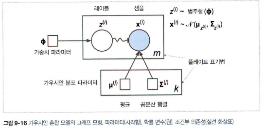
위 그림에서 원은 확률변수, 사각형은 모델의 parameter, 큰 사각형은 plate (사각형 내부 내용이 여러번 반복됨을 의미)
각 plate 오른쪽 아래 숫자(k,m)는 얼마나 plate 내부가 반복되는지를 표시한다.
각 변수 zi는 가중치 Φ를 갖는 범주형 분포에서 sampling하며,
각 변수 xi는 해당하는 클러스터 zi로 정의된 평균과, 공분산 행렬을 이용해 정규분포에서 sampling 한다.
실선 화살표는 조건부 의존성을 표현한다. (각 확률 변수 zi의 확률 분포는 가중치 벡터 Φ에 의존)
화살표가 플레이트 경계를 가로지르면 해당 플레이트의 모든 반복에 적용한다는 의미 (가중치 벡터 ϕ는 확률 변수 x1부터 xm까지 모든 확률의 분포에 필요조건)
zi에서 xi까지 구불구불한 화살표는 스위치를 의미 zi의 값에 따라 zi가 다른 가우시안 분포에서 샘플링됨
색이 채워진 원은 알려진 값이라는 의미이며, 이 경우 확률 변수 xi만 알고 있는 값(관측 변수observed variable)이다.
알려지지 않은 확률 변수 zi는 잠재 변수latent variable이다.
니다.
이 모델을 이용하며 X라는 dataset이 주어지면, 가중치 ϕ와 전체 붙포에 따라 parameter μ1 ~ μk 까지와 Σ1 ~ ΣK 까지를 추정한다.
from sklearn.mixture import GaussianMixture

gm = GaussianMixture(n_components=3, n_init=10, random_state=42)
gm.fit(X)
이후 gm.weights_와 gm.means_, gm.covariances_로 추정한 parameter를 확인할 수 있다.
진행 매커니즘은 아래와 같다.
-
cluster parameter를 랜덤하게 초기화
-
sample을 cluster에 할당 (
expectation step) -
cluster를 업데이트 (
maximization step) -
수렴할때까지 2,3 반복
GMM은 k-means와 비슷하지만, soft clustering을 사용한다.
클러스터에 속할 추정 확률로 샘플에 가중치가 적용되는데, 이 확률을 샘플에 대한 클러스터의 책임이라고 부른다.
최대화 단계에서 클러스터 업데이트는 책임이 가장 많은 샘플에 크게 영향을 받는다.
이때, 공분산 행렬에 제약을 추가하여 (covariance_type parameter 조절) 클러스터의 모양, 방향, 범위 제한 가능
### spherical
 모든 클러스터가 원형입니다. 하지만 지름은 다를 수 있습니다(즉 분산이 다릅니다).

### diag
 클러스터는 크기에 상관없이 어떤 타원형도 가능합니다. 하지만 타원의 축은 좌표 축과 나란해야 합니다
(즉 공분산 행렬이 대각 행렬이어야 합니다).

### tied
 모든 클러스터가 동일한 타원 모양, 크기, 방향을 가집니다(즉 모든 클러스터는 동일한 공분산 행렬을 공유합니다).
GMM은 타원형 cluster에만 잘 적용한다. 아래처럼, GMM은 2개가 아니라 8개의 cluster를 찾는다.

또한 GMM은 generative model이라, 이 모델에서 새로운 샘플을 만들 수 있다.
X_new, y_new = gm.sample(6)
또한 주어진 위치에서 모델의 density도 추정할 수 있다.
점수가 높을수록 밀도가 높다.
gm.score_samples(X)
만들어진 결정 경계(파선)와 밀도 등고선을 그리기 위한 코드는 아래와 같다.
from matplotlib.colors import LogNorm

def plot_gaussian_mixture(clusterer, X, resolution=1000, show_ylabels=True):
    mins = X.min(axis=0) - 0.1
    maxs = X.max(axis=0) + 0.1
    xx, yy = np.meshgrid(np.linspace(mins[0], maxs[0], resolution),
                         np.linspace(mins[1], maxs[1], resolution))
    Z = -clusterer.score_samples(np.c_[xx.ravel(), yy.ravel()])
    Z = Z.reshape(xx.shape)

    plt.contourf(xx, yy, Z,
                 norm=LogNorm(vmin=1.0, vmax=30.0),
                 levels=np.logspace(0, 2, 12))
    plt.contour(xx, yy, Z,
                norm=LogNorm(vmin=1.0, vmax=30.0),
                levels=np.logspace(0, 2, 12),
                linewidths=1, colors='k')

    Z = clusterer.predict(np.c_[xx.ravel(), yy.ravel()])
    Z = Z.reshape(xx.shape)
    plt.contour(xx, yy, Z,
                linewidths=2, colors='r', linestyles='dashed')

    plt.plot(X[:, 0], X[:, 1], 'k.', markersize=2)
    plot_centroids(clusterer.means_, clusterer.weights_)

    plt.xlabel("$x_1$", fontsize=14)
    if show_ylabels:
        plt.ylabel("$x_2$", fontsize=14, rotation=0)
    else:
        plt.tick_params(labelleft=False)

plt.figure(figsize=(8, 4))

plot_gaussian_mixture(gm, X)

save_fig("gaussian_mixtures_plot")
plt.show()
GMM - outlier detection
GMM을 outlier detection에 이용하려면, 밀도가 낮은 지역의 sample을 outlier로 두면 된다.
다만 이러기 위해서는 사용할 density threshold를 지정해야 한다. 아래 코드는 4%로 둔 것이다.
densities = gm.score_samples(X)
density_threshold = np.percentile(densities, 4)
anomalies = X[densities < density_threshold]
GMM - cluster 개수 선택하기
inertia나 실루엣 점수는 클러스터가 타원이나 크기가 다를때 안정적이지 않으므로 BIC나 AIC를 최소화하게끔 한다.

위식에서, n은 sample 개수, p는 parameter 개수, L은 모델의 likelyhood function의 최대값이다.
BIC와 AIC는 모두 학습할 파라미터가 많은(즉 클러스터가 많은) 모델에게 벌칙을 가하고 데이터에 잘 학습하는 모델에게 보상을 더한다.
이 둘은 종종 동일한 모델을 선택하지만, 다를 경우 BIC가 선택한 모델이 AIC가 선택한 모델보다 간단한(파라미터가 적은) 경향이 있다.
하지만 대규모 데이터셋에서는 데이터에 아주 잘 맞지 않을 수 있다. 계산 방법은 아래와 같다
gm.bic(X)
gm.aic(X)
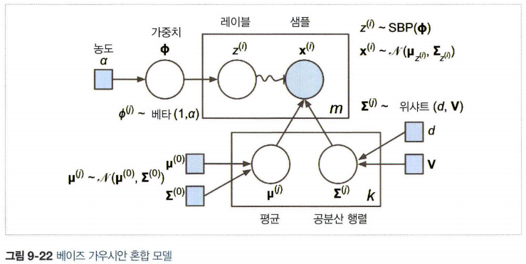
Beyesian GMM
최적의 cluster 개수를 수동으로 찾지 않고, 불필요한 cluster의 weight을 0으로 만들 수 있다.
이때 n_components에는 최적의 cluster보다 크다고 믿을 만한 값으로 지정
from sklearn.mixture import BayesianGaussianMixture

bgm = BayesianGaussianMixture(n_components=10, n_init=10, random_state=42)
bgm.fit(X)
이 모델에서 cluster parameter(가중치, 평균, 공분산 행렬 등)는 더는 잠재 확률 변수로 취급된다.
베이즈 정리 P(z|X) = p(X|z)p(z)/p(X)의 의미를 생각해보면,
GMM에서 p(X)는 계산하기 힘들다. (모든 cluster parameter와 cluster 할당의 조합을 고려해야 하기 때문)
따라서 이를 해결하기 위해 variational inference을 사용한다.